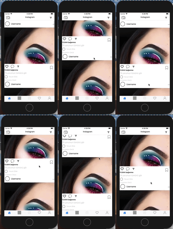
Hello friends. In this article, we will talk about how the design can be done which is one of the most difficult aspects of Xamarin.Forms. While Xamarin Forms attracts users with a lot of features, developers can be attracted by the difficult design. So in this article we will talk about how to make Instagram home page, one of the most used applications with Xamarin Forms. In a previous article we have done the design of Instagram’s home page. You can read it here.
First, we open an empty project. Then we can start to design. When we look at the general structure of Instagram, we see that it is in Tabbed Page. It consists of 5 pages. All of these pages have an icon. I had a hard time finding these icons. You can find and add better ones.
After adding 5 pages to Tabbed Page, we need to fill in the Navigation field of the page. We used to face a lot of problems to do something like that. Now with the Xamarin Forms version 3.2, we can easily edit it. We assign a grid and divide it into 3 sections. Then we add icons. Tap Gesture and click on the pictures you want.
<NavigationPage.TitleView>
         <StackLayout Orientation="Horizontal" VerticalOptions="Center" Spacing="10">
            <Grid>
                <Grid.ColumnDefinitions>
                    <ColumnDefinition Width="40"/>
                    <ColumnDefinition Width="300"/>
                    <ColumnDefinition Width="30"/>
                </Grid.ColumnDefinitions>
                <StackLayout Grid.Column="0"
                             HorizontalOptions="Start">
                     <Image WidthRequest="30"
                            HeightRequest="30"
                       Source="camera"/>
                </StackLayout>
               <StackLayout Grid.Column="1"
                            >
                    <Label Text="Instagram"
                       HorizontalOptions="Center"
                       VerticalOptions="Center"
                       FontSize="Medium"/>
                </StackLayout>
                <StackLayout Grid.Column="2"
                             HorizontalOptions="EndAndExpand">
                    <Image Source="dm"
                       WidthRequest="30"
                           HeightRequest="30"
                       VerticalOptions="Start"
                           HorizontalOptions="EndAndExpand"
                       Grid.Column="2"/>
                </StackLayout>

            </Grid>
        </StackLayout>

    </NavigationPage.TitleView>
We already know that there are only posts on the main page after these transactions. We’re putting all these postings in a listview. This place is a bit confused, but you’ll see that the fact that you’re studying isn’t that much harder. You can handle transactions with grids. You can also find the design below. We divided it into 7 rows. We can put what we want in these rows. Like I said, his icons haven’t been so good. You can find and integrate better icons.
<ListView x:Name="listPost"
                  ItemsSource="{Binding .}"
                  HasUnevenRows="true"
                  SeparatorVisibility="None"
                  >
            <ListView.ItemTemplate>
                <DataTemplate>
                    <ViewCell>
                        <Grid>
                            <Grid.RowDefinitions>
                                <RowDefinition Height="Auto"/>
                                <RowDefinition Height="Auto"/>
                                <RowDefinition Height="30"/>
                                <RowDefinition Height="Auto"/>
                                <RowDefinition Height="Auto"/>
                                <RowDefinition Height="Auto"/>
                                <RowDefinition Height="Auto"/>
                            </Grid.RowDefinitions>
                            <Grid Grid.Row="0">
                                <Grid.ColumnDefinitions>
                                    <ColumnDefinition Width="Auto"/>
                                    <ColumnDefinition Width="*"/>
                                    <ColumnDefinition Width="*"/>
                                </Grid.ColumnDefinitions>
                                <Image Grid.Column="0"
                                       Source="circle"
                                       WidthRequest="50"
                                       HeightRequest="50"/>
                                <Label Text="Username"
                                       Grid.Column="1"
                                       VerticalTextAlignment="Center"
                                       HorizontalOptions="Start"/>
                                <Label Grid.Column="2"
                                       Text="..."
                                       FontAttributes="Bold"
                                       FontSize="Medium"
                                       VerticalOptions="Center"
                                       HorizontalOptions="End"/>

                            </Grid>
                            <StackLayout Grid.Row="1">
                                <Image Source="insta.jpg"
                                       Aspect="AspectFill"
                                       HeightRequest="300"
                                       WidthRequest="300"/>
                            </StackLayout>
                            <Grid Grid.Row="2">
                                <Grid>
                                    <Grid.ColumnDefinitions>
                                        <ColumnDefinition Width="*"/>
                                        <ColumnDefinition Width="*"/>
                                        <ColumnDefinition Width="*"/>
                                    </Grid.ColumnDefinitions>
                                    <Grid Grid.Column="0">
                                        <Grid.ColumnDefinitions>
                                            <ColumnDefinition Width="*"/>
                                            <ColumnDefinition Width="*"/>
                                            <ColumnDefinition Width="*"/>
                                        </Grid.ColumnDefinitions>
                                        <Image Grid.Column="0"
                                               Source="heart"/>
                                         <Image Grid.Column="1"
                                               Source="comment.png"/>
                                         <Image Grid.Column="2"
                                               Source="dm.png"/>
                                    </Grid>
                                    <StackLayout Grid.Column="2">
                                        <Image Source="bookmart.png"
                                               HorizontalOptions="EndAndExpand"
                                               VerticalOptions="StartAndExpand"
                                               WidthRequest="50"
                                               HeightRequest="50"/>
                                    </StackLayout>
                                </Grid>
                            </Grid>
                            <StackLayout HorizontalOptions="Start"
                                         Grid.Row="3">
                                <Label Text="13.644 beğenme"
                                       FontSize="Small"
                                       FontAttributes="Bold"/>
                            </StackLayout>
                            <StackLayout Grid.Row="4"
                                         HorizontalOptions="Start">
                                <Label Text="79 yorumun tümünü gör"
                                       TextColor="Silver"/>
                            </StackLayout>
                            <Grid Grid.Row="5">
                                <Grid.ColumnDefinitions>
                                    <ColumnDefinition Width="Auto"/>
                                    <ColumnDefinition Width="*"/>
                                </Grid.ColumnDefinitions>
                                <Image Source="circle.png"
                                       WidthRequest="30"
                                       HeightRequest="30"
                                       Grid.Column="0"/>
                                <Label Grid.Column="1"
                                       VerticalTextAlignment="Center"
                                       VerticalOptions="Center"
                                       Text="Yorum Ekle"
                                       TextColor="Silver"
                                       FontSize="Small"/>
                            </Grid>
                            <StackLayout Grid.Row="6">
                                <Label Text="28 DAKIKA ÖNCE"
                                       FontSize="Micro"
                                       TextColor="Silver"/>
                            </StackLayout>
                        </Grid>
                    </ViewCell>
                </DataTemplate>
            </ListView.ItemTemplate>
        </ListView>
As you have seen below, the design screen appears.

If you have designs that you want or have difficulty doing, you can contact me by comment or mail.
Leave a Reply