Hello friends, in this article, we will talk about how to use Indicator View with Xamarin Forms. First of all, if you ask what IndicatorView is, you can access detailed information from here. You can find previous Xamarin articles here.
It is generally used when making gallery pages or in structures that can be scrolled to the side. In this way, the user can see how many items are sideways. We used to use different Nuget Packages for this in the past, but as of Xamarin 5.0 versions, we can do it using IndicatorView. If you are using one of the Xamarin 4.x.x versions, you should add a Flag. Because it was more experimental in these versions and its use was not recommended.
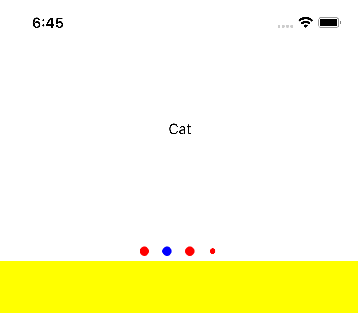
In our example, we will put a CarouselView to occupy one-third of the screen. We will use an IndicatorView to show how many items are in the CarouselView. I will display animal names in CarouselView. You can also use your own different designs. The design is as follows.

<?xml version="1.0" encoding="utf-8" ?>
<ContentPage xmlns="http://xamarin.com/schemas/2014/forms"
             xmlns:x="http://schemas.microsoft.com/winfx/2009/xaml"
             x:Class="indicator_view.MainPage">

    <Grid HorizontalOptions="FillAndExpand"
          VerticalOptions="FillAndExpand">
        <Grid.RowDefinitions>
            <RowDefinition Height="*"/>
            <RowDefinition Height="2*"/>
        </Grid.RowDefinitions>
        <Grid HorizontalOptions="FillAndExpand"
              VerticalOptions="FillAndExpand"
              Grid.Row="0">
            <CarouselView HorizontalOptions="FillAndExpand"
                          VerticalOptions="FillAndExpand"
                          HorizontalScrollBarVisibility="Never"
                          VerticalScrollBarVisibility="Never"
                          x:Name="collectionView"
                          Loop="False"
                          IndicatorView="{x:Reference indicatorView}">
                <CarouselView.ItemTemplate>
                    <DataTemplate>
                        <Grid HorizontalOptions="FillAndExpand"
                              VerticalOptions="FillAndExpand">
                            <Label HorizontalOptions="FillAndExpand"
                                   VerticalOptions="FillAndExpand"
                                   HorizontalTextAlignment="Center"
                                   VerticalTextAlignment="Center"
                                   Text="{Binding Name}"/>
                        </Grid>
                    </DataTemplate>
                </CarouselView.ItemTemplate>
            </CarouselView>
            <IndicatorView HorizontalOptions="Center"
                           VerticalOptions="End"
                           IndicatorColor="Red"
                           SelectedIndicatorColor="Blue"
                           x:Name="indicatorView"
                           HideSingle="False"
                           IndicatorsShape="Circle"
                           IndicatorSize="10"/>
        </Grid>
        <Grid HorizontalOptions="FillAndExpand"
              VerticalOptions="FillAndExpand"
              Grid.Row="1"
              BackgroundColor="Yellow"/>
    </Grid>

</ContentPage>
using System;
using System.Collections.Generic;
using System.Collections.ObjectModel;
using System.ComponentModel;
using System.Linq;
using System.Text;
using System.Threading.Tasks;
using Xamarin.Forms;

namespace indicator_view
{
    public partial class MainPage : ContentPage
    {
        public MainPage()
        {
            InitializeComponent();
            collectionView.ItemsSource = GetAnimals();
        }

        ObservableCollection<Animal> GetAnimals()
        {
            return new ObservableCollection<Animal>()
            {
                new Animal
                {
                    Name = "Dog"
                },
                new Animal
                {
                    Name = "Cat"
                },
                new Animal
                {
                    Name = "Horse"
                },
                new Animal
                {
                    Name = "Monkey"
                },
                new Animal
                {
                    Name = "Bird"
                }
            };
        }
    }

    public class Animal
    {
        public string Name { get; set; }
    }
}
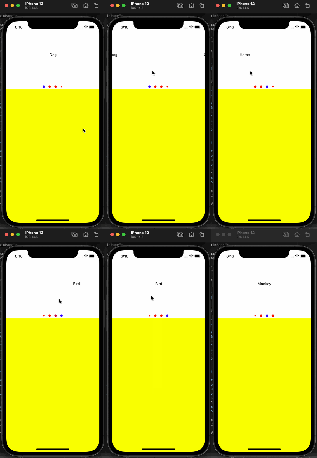
If you want the CarouselView to return directly after the last element in your project, you should set the Loop property to True. If you want the IndicatorView not to appear when there is only one item, it will be enough to set the HideSingle property as True. You can use many different features like this. Below is an image of how it works.

If you have questions, you can reach us by sending an e-mail or comment. Good work.
Leave a Reply