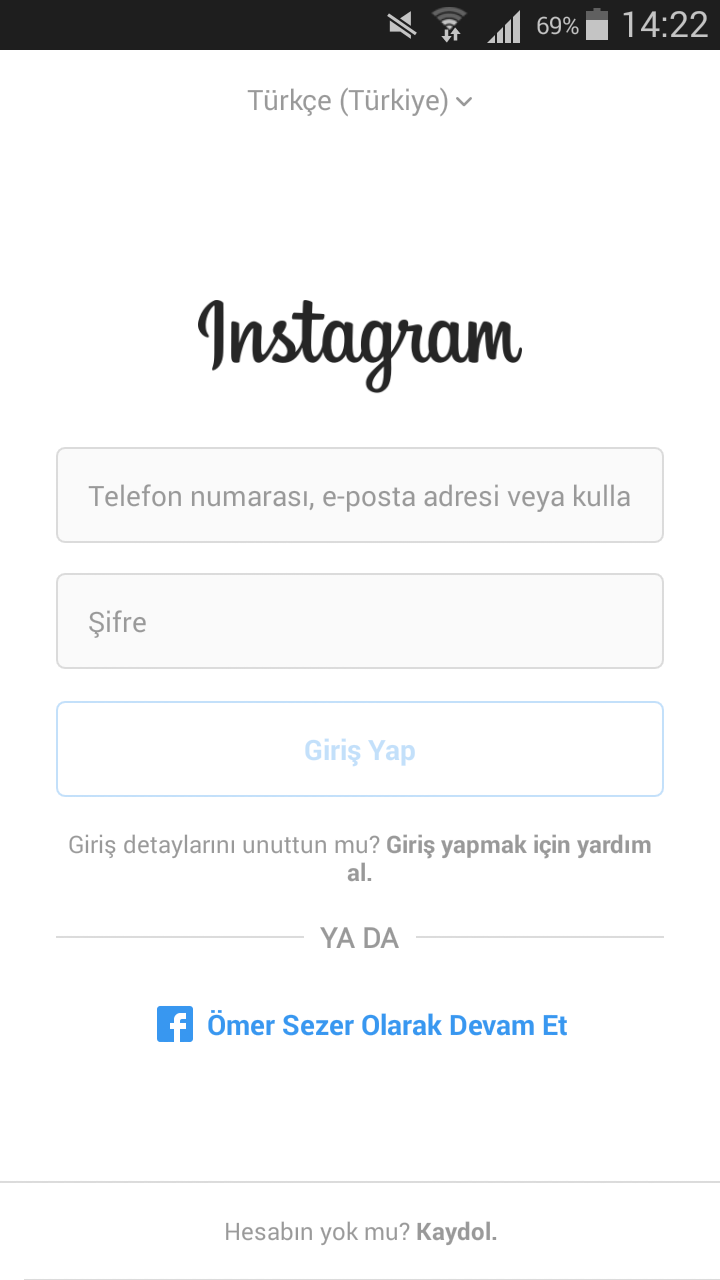
Hello friends. In this article I will talk about how to design an Instagram with Xamarin Forms. Designing with Xamarin Forms is more difficult than drag and drop design. I really wanted it to be an example for beginners by not being so difficult and designing the screens of large applications. Below is the current entry page of Instagram.

It’s actually a very simple screen. The general feature of large applications; it’s simple. This prevents the user from escaping fearfully. This is the case in almost all major applications.
Now we are creating an empty project first. When we build it, we do a rebuild and make the project sit. Then we come to the side of Xaml which is the design part of a page which is either created or created by you. You can find the code for the progeny below or on GitHub, but I still want to tell you.
Here is the first language selection section at the beginning of the page. When you are touched, a picker will pop down and you will be able to choose a language from here. We just made the design. You can do this with a renderer if you like.
Then there is the instagram logo. This is actually a font, but I took it directly as a logo and put it on the screen. Down the Logon is the entrance. Here is the username and password requested from us. Here you can see the design patterns below. The thing you will have to struggle here is to give different features in the same label maybe written. To do this is to add span to the text you need to do. Examples are already available below. I put straight lines in box views.
<?xml version="1.0" encoding="utf-8" ?>
<ContentPage xmlns="http://xamarin.com/schemas/2014/forms"
             xmlns:x="http://schemas.microsoft.com/winfx/2009/xaml"
             x:Class="InstagramApp.Views.LoginPage"
             BackgroundColor="White">
    <ContentPage.Content>
        <StackLayout Padding="10,45,10,0">
            <!-- Basşlık kımında bulunan dil seçme bölümü -->
            <StackLayout HorizontalOptions="Center">
                <Label Text="Türkçe (Türkiye) ↓ "
                       TextColor="#999999"
                       />
            </StackLayout>
            <!-- Instagram logosu -->
            <StackLayout HorizontalOptions="Center"
                         Margin="80,20,80,20">
                <Image Source="intagram.png"
                       Aspect="AspectFill"/>
            </StackLayout>
            <!-- Kullanıcı giriş ekranı-->
            <StackLayout Padding="5,20,5,0">
                <StackLayout Padding="0,3,0,3">
                    <Entry Text="Telefon numarası,e-posta adresi veya kullanıcı adı"
                       HeightRequest="50"
                       BackgroundColor="#fafafa"
                       TextColor="#999999"/>

                </StackLayout>
                <StackLayout Padding="0,3,0,3">
                    <Entry Text="Şifre"
                       HeightRequest="50"
                       BackgroundColor="#fafafa"
                       TextColor="#999999"/>
                </StackLayout>
                <StackLayout Padding="0,3,0,3">
                    <Button BackgroundColor="Transparent"
                        Text="Giriş Yap"
                        HeightRequest="50"
                        TextColor="#c5e1fa"
                        BorderColor="#c5e1fa"
                        BorderWidth="1"
                        />
                </StackLayout>
                <StackLayout Padding="0,10,0,0">
                    <Label HorizontalTextAlignment="Center">
                        <Label.FormattedText>
                            <FormattedString>
                                <Span Text="Giriş detaylarını unuttun mu ?"
                       FontSize="Small"
                       TextColor="#999999"/>
                                <Span Text="Giriş yapmak için yardım al."
                           FontSize="Small"

                           TextColor="#999999"
                           FontAttributes="Bold"/>
                            </FormattedString>
                        </Label.FormattedText>
                    </Label>

                </StackLayout>
            </StackLayout>
            <!-- Ya da kısmı-->
            <Grid Padding="5,10,5,0">
                <Grid.ColumnDefinitions>
                    <ColumnDefinition Width="*"/>
                    <ColumnDefinition Width="Auto"/>
                    <ColumnDefinition Width="*"/>
                </Grid.ColumnDefinitions>
                <StackLayout Grid.Column="0"
                             VerticalOptions="Center">
                    <BoxView Color="#999999"
                         Grid.Column="0"
                         HeightRequest="1"/>
                </StackLayout>
                <StackLayout Grid.Column="1"
                             VerticalOptions="Center">
                    <Label Text="YA DA"
                       TextColor="#999999"/>
                </StackLayout>
                <StackLayout Grid.Column="2"
                             VerticalOptions="Center">
                    <BoxView Color="#999999"
                         Grid.Column="0"
                         HeightRequest="1"/>
                </StackLayout>
            </Grid>
            <!-- Facebook ile devam ediş-->
            <Grid Padding="20,40,20,20">
                <Grid.ColumnDefinitions>
                    <ColumnDefinition Width="50"/>
                    <ColumnDefinition Width="Auto"/>
                </Grid.ColumnDefinitions>
                <StackLayout Grid.Column="0"
                             HorizontalOptions="End">
                    <Image Source="facebook.png"
                           HeightRequest="30"
                           WidthRequest="30"
                           Aspect="AspectFit"/>
                </StackLayout>
                <StackLayout Grid.Column="1"
                             HorizontalOptions="Start"
                             VerticalOptions="CenterAndExpand">
                    <Label Text=" Ömer Sezer Olarak Devam Et"
                           FontAttributes="Bold"
                           VerticalTextAlignment="Center"
                           TextColor="#3897f0"/>
                </StackLayout>
            </Grid>
            <!-- Son olarak aşağıda bulunan çizgiyi çekiyorum-->
            <StackLayout VerticalOptions="EndAndExpand"
                         Padding="0,0,0,20">
                <StackLayout Padding="0,0,0,15">
                    <BoxView Color="#999999"
                         HeightRequest="1"/>
                </StackLayout>
                <!-- En son olarak ise Hesabın yok mu kaydol bölümü yapıyorum-->
                <StackLayout>
                    <Label HorizontalTextAlignment="Center">
                        <Label.FormattedText>
                            <FormattedString>
                                <Span Text="Hesabın yok mu ?"
                                      FontSize="Small"
                                      TextColor="#999999"/>
                                <Span Text=" Kaydol."
                                      FontSize="Small"
                                      TextColor="#999999"
                                      FontAttributes="Bold"/>
                            </FormattedString>
                        </Label.FormattedText>
                    </Label>
                </StackLayout>
            </StackLayout>
        </StackLayout>
    </ContentPage.Content>
</ContentPage>
If you have any questions about our design, you can contact me by paying or commenting. If you want to reach the project via Github, you can get it here. Good works.
Leave a Reply