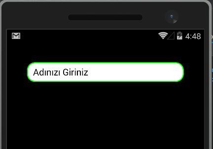
One of the most challenging issues when working with cross-platfrom in Xamarin is design. For example, when we check an entry, we can not say that the project has a lot of appeal when we look at the design. We must write Custom Renderer for each platform by taking advantage of the script we wrote earlier in our project.
If I want my entities to look like it, I have to give them a shape. I’ll do this on the Android side as an example. In the Drawable folder under the Resources folder under the project section, we create an xml file that will determine how our entry will look. I gave this file the name RoundedEntry. After creating the file, we need to write some code. We determine which color will be used for solid and entrynin. With Stroke, we choose which color the roundness of the entry just outside will be. With the Cornes feature we determine how to look in 4 directions. If you need something like this, you can change it according to it.
<?xml version="1.0" encoding="utf-8" ?>
<shape xmlns:android="http://schemas.android.com/apk/res/android"
android:shape="rectangle" android:padding="10dp" >
  <solid android:color="#FFFFFF"/>
  <stroke android:width="2dp" android:color="#00FF00" />
  <corners
   android:bottomRightRadius="15dp"
   android:bottomLeftRadius="15dp"
   android:topLeftRadius="15dp"
   android:topRightRadius="15dp"/>
</shape>
After we have done the xml part we are coming to write a Custom Renderer on the Android part. Again, I’m opening the Custom Renderers folder under the Android platform and opening a class called CustomRoundedEntryRenderer to quickly find what my files look like and search for them right away. This class is the class that will enable us to see the entrances we create in this class when we use entrances that are the defaults in our project. We first set this class to inherit from the EntryRenderer, and then override the OnElementChanged function. After we have done these, we check to see if we have our control. If there is an entry, we call this control the form we created in the RoundedEntry file under the Drawable folder under our Resource folder. We also write the phrase that this page is a Custom Renderer, which is a must for Custom Renderer.
[assembly: ExportRenderer(typeof(RoundedEntry.CustomRenderers.RoundedEntry),
typeof(CustomRoundedEntryRenderer))]
namespace RoundedEntry.Droid.CustomRenderers
{
    public class CustomRoundedEntryRenderer: EntryRenderer
    {
        protected override void OnElementChanged(ElementChangedEventArgs<Entry> e)
        {
            base.OnElementChanged(e);
            if (Control!=null)
            {
                Control.Background = this.Resources.GetDrawable(Resource.Drawable.RoundedEntry);
            }
        }
    }
}
Of course I do not want all my entities to be the same, so I set up a class in the portable layer and set this class to inherit from the entry control. I actually mentioned this in Custom Renderer. Actually, that’s all we do. Very easy and simple operations. Finally we need to show it on a page that this is our new control. You can do this on the xaml side as you can on the cs side. Cs on the side is very simple to do but you need to add a line of code to do it on the xaml side. Since we can use a variable called Rounded Entry, we need to add xmlns: RoundedEntry = “clr-namespace: RoundedEntry.CustomRenderers”.
<?xml version="1.0" encoding="utf-8" ?>
<ContentPage xmlns="http://xamarin.com/schemas/2014/forms"
             xmlns:x="http://schemas.microsoft.com/winfx/2009/xaml"
             xmlns:RoundedEntry="clr-namespace:RoundedEntry.CustomRenderers"
             x:Class="RoundedEntry.Views.AnaSayfa">
    <ContentPage.Content>
        <StackLayout Padding="40">
            <RoundedEntry:RoundedEntry
                Placeholder="Adınızı Giriniz"/>
        </StackLayout>
    </ContentPage.Content>
</ContentPage>

If you want to study the project you can reach here.
Comments (3)
Emre özinalsays:
Tuesday November 21st, 2017 at 03:58 PMBu konuyu ilk defa türkçe buldum teşşekürler
Hassan Moujahedsays:
Saturday September 25th, 2021 at 12:38 PMHi
Binding property does’nt work
Hassan Moujahedsays:
Saturday September 25th, 2021 at 12:45 PMHi Im sorry its working i had syntax error