Hello friends. In this article, we will talk about using Xamarin Forms and Range Slider. First of all, let’s talk about what Range Slider is. Range Slider is actually a slider structure that can be changed by 2 pieces. This allows us to specify a specific range instead of actually expecting an integer from the user. For example, we will want to enter the weight range, rather than entering the entrances in terms of design rather than a nice way to use the Range Slider would be better for us.
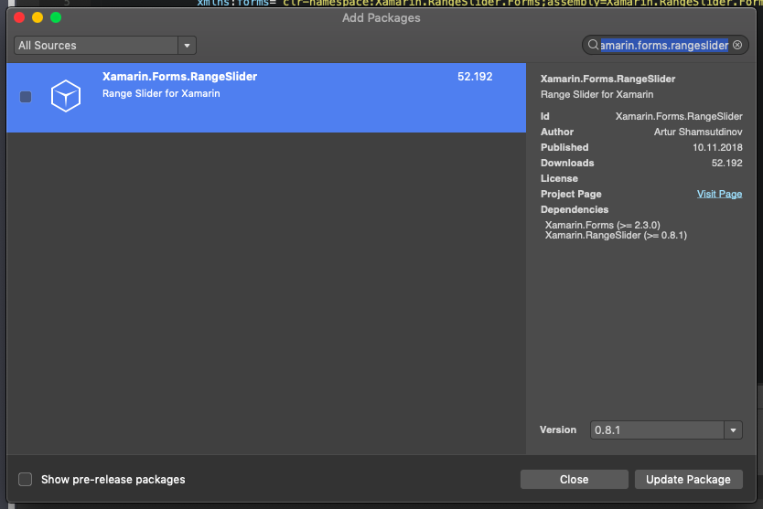
To use Range Slider, we need to install a Nuget package. This package is open source and can be viewed here. Package name: Xamarin.Forms.RangeSlider.
You are adding it to your project in Nuget Package
Android and iOS after adding the process we have to do. There is a bit of problem in the iOS layer at the moment, in order to overcome them, you need to paste the following code snippet into the App Delegate class in the iOS layer.
#if NETFX_CORE
[assembly: Xamarin.Forms.Platform.WinRT.ExportRenderer(typeof(Xamarin.RangeSlider.Forms.RangeSlider), typeof(Xamarin.RangeSlider.Forms.RangeSliderRenderer))]
#else
[assembly: Xamarin.Forms.ExportRenderer(typeof(Xamarin.RangeSlider.Forms.RangeSlider), typeof(Xamarin.RangeSlider.Forms.RangeSliderRenderer))]
#endif
Then we have to paste the following code snippet into the FinishedLaunching function in this class.
var t1 = typeof(Xamarin.RangeSlider.RangeSliderControl);
            var t2 = typeof(RangeSliderRenderer);
It doesn’t stop there. As I said in the 0.8.1 version, the project works very stable for Android, while it is a bit problematic for iOS. You will need to download the source code from the above.
Then we can use it in the Portable layer. First I’ll add it to the header to see it on the xaml side. Then I start to design. First of all, I have to give the minimum and maximum values. So the user should choose between these values. After that, with Step Value feature, I specify that it will increase. maybe it’s up to you. If there is an occasional number, you can take it to the nearest number with the stepCalueContinuosly feature. Then there are the design sections for you. Colors, text colors, whether or not the text appears.
<?xml version="1.0" encoding="utf-8" ?>
<ContentPage xmlns="http://xamarin.com/schemas/2014/forms"
             xmlns:x="http://schemas.microsoft.com/winfx/2009/xaml"
              xmlns:forms="clr-namespace:Xamarin.RangeSlider.Forms;assembly=Xamarin.RangeSlider.Forms" >
    <Grid HorizontalOptions="FillAndExpand"
          VerticalOptions="FillAndExpand">
        <Grid.RowDefinitions>
            <RowDefinition Height="Auto"/>
            <RowDefinition Height="Auto"/>
            <RowDefinition Height="Auto"/>
            <RowDefinition Height="Auto"/>
        </Grid.RowDefinitions>
        <Button Grid.Row="0"
                BorderRadius="5"
                BackgroundColor="AliceBlue"
                TextColor="Blue"
                Text="RESET"
                HorizontalOptions="Center"
                VerticalOptions="Center"/>

        <forms:RangeSlider
            Grid.Row="2"
            x:Name="rangeSliderAge"
            MinimumValue="50"
            MaximumValue="164"
            LowerValue="50"
            UpperValue="164"
            StepValue="1"
            StepValueContinuously="True"
            TextSize="20"
            ShowTextAboveThumbs="True"/>

    </Grid>

</ContentPage>
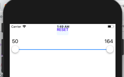
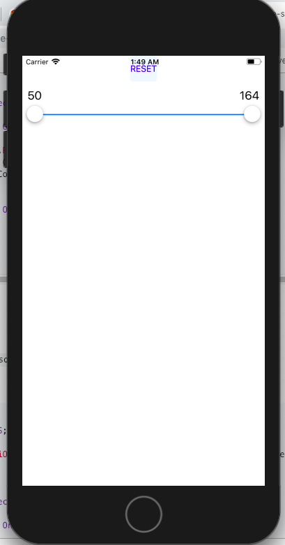
When we run the project, there is a screenshot like below.
If you have questions, you can reach us by e-mail or comment.
Leave a Reply