Hello friends. In this article, we will talk about how to make a SearchBar with SwiftUI. As you know, friends who previously developed iOS with UIKit could add the UISearchBar control directly to their projects. There is no such control in SwiftUI. You can solve this in 2 different ways. These;
- Making a search bar using TextField
- Using UISearchBar in our project
Frankly, I prefer the first of these. Because we have all kinds of customization possibilities, but you can use the other option if you are not going to customize too much and it is a control you know from UIKit.
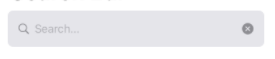
I take the page into Navigation View so that the Search Bar I will create does not stick to the top. I’m creating a VStack. I’m going to split the screen vertically and throw an HStack for the Search Bar, which I will create at the top. The lower side will remain empty for now. You can customize it according to your page structure. I put a TextField into the HStack we created at the top. In this way, users will be able to search through this TextField. We are also giving padding as we will put a search icon on the edge. We set this to be the leading 24. Let me give you a little tip here. As you may have noticed, it usually doesn’t use expressions like apple right, left, start & end. The reason for this is that in languages such as Arabic, it flips the screen completely and sets it to have a beginning and an end. These reasons use expressions such as leading and trailing.
After adding TextField to search inside HStack, we come out of HStack. We give a padding so that HStack doesn’t exactly stick to the edges. Then we give the color of HStack and all the controls inside it to a dark gray. I directly used the color of the system, but you can use any color you want. We give a radius so that the edges do not look too sharp and we are actually done here. Now we need to add a search icon and a cross icon to delete our pity. For this we need to put a view on HStack. We can do this with overlay. We add an overlay to HStack and add an HStack there. We add a Spacer to the far right, the Search icon in the middle to be empty, and a button with a cross icon at the end. The last step is to color them and adjust the padding. After that, it is up to your definition of action. I got these icons from the system. You can change it with the icons you want.
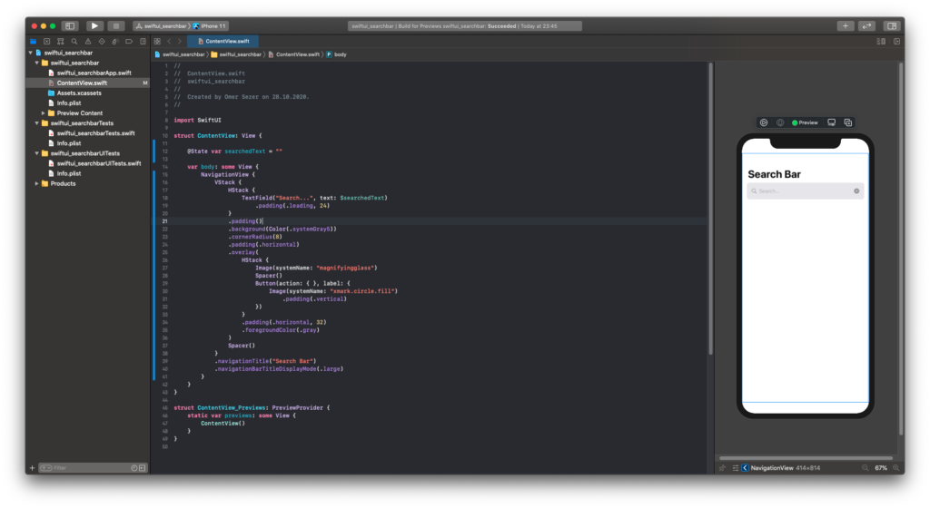
//
//  ContentView.swift
//  swiftui_searchbar
//
//  Created by Omer Sezer on 28.10.2020.
//

import SwiftUI

struct ContentView: View {

    @State var searchedText = ""

    var body: some View {
        NavigationView {
            VStack {
                HStack {
                    TextField("Search...", text: $searchedText)
                        .padding(.leading, 24)
                }
                .padding()
                .background(Color(.systemGray5))
                .cornerRadius(8)
                .padding(.horizontal)
                .overlay(
                    HStack {
                        Image(systemName: "magnifyingglass")
                        Spacer()
                        Button(action: { }, label: {
                            Image(systemName: "xmark.circle.fill")
                                .padding(.vertical)
                        })
                    }
                    .padding(.horizontal, 32)
                    .foregroundColor(.gray)
                )
                Spacer()
            }
            .navigationTitle("Search Bar")
            .navigationBarTitleDisplayMode(.large)
        }
    }
}

struct ContentView_Previews: PreviewProvider {
    static var previews: some View {
        ContentView()
    }
}
If you have questions, you can reach by e-mail or comment. Good work.
Leave a Reply